Customizing various aspects of groups
Customizing group names
You can customize the display of group names through the following CSS properties:
-
label
-
labelVisible
-
labelFont
-
labelForeground
-
labelBackground
-
labelPosition
-
labelAntialiasing
-
labelSpacing
-
labelWrappingMode
-
labelWrappingWidth
-
labelWrappingHeight
-
labelMargin
-
labelAlignment
-
labelBorderColor
-
labelDirection
-
lineSpacing
-
minLabelZoom
-
maxLabelZoom
-
labelScaleFactor
Refer to Customizing the label of a business object for details on these properties and how to use them.
Customizing group icons
The following table lists the CSS properties that can be used to customize the group icon.
|
Property Name |
Type |
Default Value |
Description |
|
icon |
Image |
null |
Defines the icon to be displayed in the group. |
|
iconVisible |
boolean |
true |
Defines whether the icon is visible or not in the group. |
How to customize a group icon
The following example adds a test icon to all groups present in the graphic component.
object."ilog.tgo.model.IltGroup" {
iconVisible: true;
icon: '@|image("test.png")';
}
Customizing group shortcuts
The shortcut representation is displayed according to the business object CSS configuration. The following properties can be used to customize the shortcut representation.
|
Property Name |
Type |
Default Value |
Description |
|
shortcutIcon |
Image |
ilt_shortcut.png for the standard representation ilt_dangling_shortcut.png for the dangling representation |
Defines the icon to be used in the shortcut representation. |
|
shortcutIconVisible |
boolean |
true |
Defines whether the shortcut icon is displayed or not. |
The result is shown in the following images:
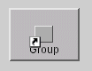
Standard shortcuts
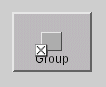
Dangling shortcuts
Customizing group states and alarms
By default, groups do not graphically represent the primary state information. This behavior can be changed through the following CSS property:
|
Property Name |
Type |
Default Value |
Description |
|
baseStyleEnabled |
boolean |
false |
Denotes whether the object base representation is affected by states and alarms present in the object. |
You can also customize the visibility and characteristics of secondary states, alarm balloons and alarm counts, as in the other predefined business objects.
For more information, refer to Customizing object and alarm states of predefined business objects.
Customizing the group information cluster
All the structural and state information on a group—that is, its label, icon, plinth, secondary state modifiers, and alarm balloon—are gathered into what is called the information cluster of the group.
This cluster is positioned by placing a reference decoration at the center of the group. The reference decoration is listed below and is applied in the given order:
-
The plinth, if there is one; otherwise the secondary state modifiers serve as this reference decoration, if there are any.
-
If there are no secondary state modifiers, the reference decoration is the label, or the icon if there is no label.
The center of the group is the center of the rectangle for a rectangular group, the gravity center for polygonal groups, and the midpoint of the middle segment for linear groups.
You can modify the default positioning of the group information cluster by setting its relative position as an offset.
When a transformer is applied to the group, that is, when it is moved or scaled, the same transformer is applied to the offset of the group information cluster. In other words, the cluster follows the group. This is true regardless of whether the cluster position was specified with absolute or relative coordinates.
However, when the shape of the group is changed or the group is moved, the transformation of the group shape is not guaranteed to be affine. As a result, this change in the group shape is likely to change the default position of the group information cluster. You can specify whether such a shape change will affect the cluster position or whether the cluster will keep the same absolute coordinates. The property pinDecorations determines whether the position of the group information cluster is considered relative to the default position and will thus change if the default value changes.
You can define the above characteristics using CSS, with the following properties:
|
Property Name |
Type |
Default Value |
Description |
|
decorationsOffset |
IlpPoint |
null |
Denotes the offset used to attach the group information cluster to the group base. |
|
decorationsOffsetZoomable |
boolean |
false |
Denotes whether the offset used to attach the group information cluster to the base can be zoomed or not. |
|
pinDecorations |
boolean |
false |
Denotes whether the group information cluster remains unchanged even if the group has its shape changed. |
The characteristics of the plinth decoration that is added to the group graphic representation can also be customized, using the following properties.
|
Property Name |
Type |
Set |
Default Value |
Description |
|
plinthColor |
Color |
Yes |
67% grey |
Denotes the color of the plinth. |
|
plinthBrightColor |
Color |
Yes |
87% grey |
Denotes the brighter color of the plinth. |
|
plinthDarkColor |
Color |
Yes |
33% grey |
Denotes the darker color of the plinth. |
|
plinthVisible |
boolean |
No |
true |
Denotes whether the plinth is visible or not. |
|
plinthVerticalMargin |
int |
No |
1 |
Defines the vertical margin between the plinth and its contents. |
|
plinthHorizontalMargin |
int |
No |
4 |
Defines the horizontal margin between the plinth and its contents. |
Customizing group connection ports
The default behavior of links attached to groups is that they connect to the gravity decoration. If a group does not have a label, an icon, a secondary state or any other gravity decoration, the link connects to the base of the group. If the group has a label, the link connects to the label so that you can only edit the link ports around the label. The same is true for other decorations as well as for the plinth.
You can change this behavior through the property linksConnectToBase to make sure that the links always connect to the base:
|
Property Name |
Type |
Default Value |
Description |
|
linksConnectToBase |
boolean |
false |
Denotes whether links always end at the group base. If this property is set to true, links connect to the bounding box of the base. Otherwise, they connect to the group information cluster, if one is present. |
See also Customizing node and link layouts.
Customizing group tooltips
You can customize the display of group tooltips through the following CSS properties:
-
toolTipGraphic
-
toolTipText
For details on these properties and how to use them, refer to Changing the font of all labels.
Adding new decorations to groups
You can add new decorations to the predefined business objects representation.
For details, refer to How to add new decorations to network and equipment nodes.


