Customizing user-defined network nodes
Describes how to customize the shape, color, and other aspects of user-defined network nodes.
Lists all the properties you can use to customize a node shape and describes how to customize sizing aspects of the shape.
Lists the values of the node properties related to color and shows the effects they give.
Lists the properties related to the node border and shows how to use them with an example.
Describes how to display an icon in a network node and how to position it with respect to the label.
Describes how to customize the display of a label in a network node representation.
Describes how automatic resizing of a shape with an icon operates.
Customizing a node shape
You can customize the node shape using the properties listed in the following table.
.
|
Property Name |
Type |
Default Value |
Description |
|
shapeType |
int |
ROUND_RECTANGLE |
Sets the shape of an ilog.views.sdm.graphic.IlvGeneralNode. The values are those accepted by setShapeType. |
|
shapeWidth |
float |
40 |
Sets the width of the shape of an ilog.views.sdm.graphic.IlvGeneralNode. |
|
shapeHeight |
float |
40 |
Sets the height of the shape of an ilog.views.sdm.graphic.IlvGeneralNode. Use only when the value of the property keepingAspectRatio is false. |
|
shapeAspectRatio |
float |
1 |
Sets the aspect ratio of the shape of an ilog.views.sdm.graphic.IlvGeneralNode. |
|
keepingAspectRatio |
boolean |
true |
Specifies whether the width/height ratio is preserved by the value of the properties shapeWidth and shapeHeight. |
|
foreground |
Color |
Color.darkGray |
Denotes the node foreground color. |
|
background |
Color |
Color(192,192,192,128) |
Denotes the node background color. |
|
fillStyle |
int |
SOLID_COLOR |
Sets the style used to fill the shape of an ilog.views.sdm.graphic.IlvGeneralNode. The possible values are those defined in ilog.views.sdm.graphic.IlvGeneralNode#setFillStyle : NO_FILL SOLID_COLOR LINEAR_GRADIENT RADIAL_GRADIENT TEXTURE |
|
fillTexture |
Image |
null |
Sets the texture used to fill the shape of the general node or the general link. |
|
fillAngle |
float |
0 |
Sets the angle (in degrees) of the gradient used to fill the shape of an ilog.views.sdm.graphic.IlvGeneralNode. |
|
fillStart |
float |
0f |
Sets the position where the gradient of a fillColor2 starts; that is, where the color is the first color set by background. |
|
fillEnd |
float |
1f |
Sets the position where the gradient of an ilog.views.sdm.graphic.IlvGeneralNode ends; that is, where the color is the first color set by fillColor2. |
|
horizontalAutoResizeMargin |
float |
2f |
Sets the margin that is left on both sides of the shape when it is horizontally resized automatically. |
|
horizontalAutoResizeMode |
int |
NO_AUTO_RESIZE |
Sets the horizontal autoresize mode of an IlvGeneralNode. The possible values are those accepted by ilog.views.sdm.graphic.IlvGeneralNode#setHorizontalAutoResizeMode : NO_AUTO_RESIZE EXPAND_ONLY SHRINK_ONLY EXPAND_OR_SHRINK |
|
verticalAutoResizeMargin |
float |
2f |
Sets the margin that is left on both sides of the shape when it is automatically resized vertically. |
|
verticalAutoResizeMode |
int |
NO_AUTO_RESIZE |
Sets the vertical autoresize mode of an ilog.views.sdm.graphic.IlvGeneralNode. The possible values are: NO_AUTO_RESIZE EXPAND_ONLY SHRINK_ONLY EXPAND_OR_SHRINK |
|
icon |
Image |
null |
Determines the image used for the icon. |
|
iconPosition |
Bottom |
Sets the position of the icon with respect to the label of an IlvGeneralNode. This property is only effective if the label position is equal to IlvDirection.Center, that is, the label is inside the shape. If the label is outside the shape, the icon is always at the center of the shape. The value is one of the static fields of the {@link.ilog.views.IlvDirection} interface. |
|
|
iconVisible |
boolean |
true |
Denotes whether the icon is visible or not in the object. |
|
borderColor |
Color |
120,120,120 |
Sets the color of the shape border. |
|
borderEndCap |
BasicStroke |
BasicStroke.CAP_BUTT |
Sets the end cap style of the shape border. The end cap style controls what the ends of the segments of the border look like when the border is dashed. The possible values are: CAP_BUTT CAP_ROUND CAP_SQUARE |
|
borderLineJoin |
BasicStroke |
BasicStroke.JOIN_MITER |
Sets the line join style of the shape border. The line join property controls what the angles connecting the segments of the border look like. The possible values are: JOIN_BEVEL JOIN_MITER JOIN_ROUND |
|
borderMiterLimit |
float |
10f |
Sets the miter limit of the shape border. The miter limit controls how far the angles of the border are allowed to extend when the angle is very sharp. |
|
borderWidth |
float |
2 |
Sets the width of the border of the object. |
|
borderLineStyle |
float[] |
null (Solid) |
Sets the line style of the shape border. The line style allows you to have a dashed border. For example, setting the line style to 4,8 creates a dashed border with segments of 4 pixels in length separated by spaces of 8 pixels. The line style can contain more than two values to create longer line style patterns. |
|
borderLineStylePhase |
float |
0f |
Sets the line style phase of the shape border. This property can be used to adjust the positions of the dashes on the border. This is useful if the dashes look unattractive at the corners of the shape. |
How to use network node properties in a user-defined business class
object."test.MyNetworkElement" {
shapeType: ROUND_RECTANGLE;
shapeWidth: 30;
shapeHeight: 30;
label: @name;
labelSpacing: 3;
}
Shape type
The basic shape of the user-defined node is controlled by the shapeType property. The possible values are listed in the following table.
|
CSS Property and Values |
Rendering |
|
shapeType = RECTANGLE |
|
|
shapeType = ROUND_RECTANGLE |
|
|
shapeType = ELLIPSE |
|
|
shapeType = DIAMOND |
|
|
shapeType = TRIANGLE_UP |
|
|
shapeType = TRIANGLE_DOWN |
|
|
shapeType = TRIANGLE_LEFT |
|
|
shapeType = TRIANGLE_RIGHT |
|
|
shapeType = MARKER |
|


How to control the width and height of the shape of a user-defined business object
The horizontal and vertical sizes of the shape are controlled through the properties shapeWidth, shapeHeight, and shapeAspectRatio.
There are two policies for setting the width and height of the shape.
-
You can set the properties shapeWidth and shapeHeight. In this case, the aspect ratio of the shape is not preserved.
For example:
#Node {
shapeWidth: 100;
shapeHeight: 50;
}
-
You can set the property shapeWidth to the desired width and the property shapeAspectRatio to the desired width:height ratio. For example:
#Node {
shapeWidth: 100;
shapeAspectRatio: 2;
}
If you change the shape width in another rule, the aspect ratio will be preserved.
The property keepingAspectRatio is used to preserve the width to height ratio. This property sets a flag that specifies whether the width to height ratio is preserved by the properties shapeWidth and shapeHeight.
If the flag is set to true, the dimensions of the shape are controlled by calling either shapeWidth or shapeHeight and by setting shapeAspectRatio.
If the flag is set to false, the dimensions of the shape are controlled by setting shapeWidth and shapeHeight.
Setting shapeHeight explicitly also causes the keep aspect ratio flag to be set to false. Setting shapeAspectRatio causes the keep aspect ratio flag to be set to true.
If the keep aspect ratio flag is true, the properties shapeWidth and shapeHeight will preserve the width-to-height ratio of the shape of the node. Otherwise, you can set the width and the height independently.
Customizing the color of a node shape with paint styles
The following properties control the way the interior of the shape is painted: fillStyle, foreground, background, fillStart, fillEnd, fillAngle, and fillTexture.
The fillStyle property specifies the type of paint object used to fill the shape. The possible values are listed in the following table.
|
CSS Property and Values |
Rendering |
|
fillStyle = SOLID_COLOR |
|
|
fillStyle = LINEAR_GRADIENT |
|
|
fillStyle = RADIAL_GRADIENT |
|
|
fillStyle = TEXTURE |
|


The foreground and background properties specify the colors used:
-
In SOLID_COLOR mode, the shape is filled with foreground.
-
In LINEAR_GRADIENT and RADIAL_GRADIENT modes, the gradient starts with foreground and ends with background :
|
CSS Properties and Values |
Rendering |
|
fillStyle = LINEAR_GRADIENT foreground = blue background = red |
|
|
fillStyle = RADIAL_GRADIENT foreground = blue background = red |
|


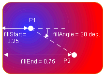
In LINEAR_GRADIENT and RADIAL_GRADIENT modes, the fillStart, fillEnd, and fillAngle properties define the geometry of the gradient. A gradient is defined by two points, P1 and P2. The following figures show the results of the properties.
The following figure shows the geometry of a linear gradient.

Linear gradient
Note that the linear gradient is always in reflect mode, so the colors go back and forth from foreground to background outside the (P1, P2) segment.
The following figure shows the geometry of a radial gradient.
Radial gradient
The fillTexture property specifies an image that will be used as a texture in TEXTURE mode.
Customizing the border of a node shape
Properties for customizing a node border
The border of the shape is controlled by the properties borderColor, borderWidth, borderLineStyle, borderEndCap, borderLineJoin, borderMiterLimit, and borderLineStylePhase.
The borderColor property sets the color used to paint the border.
The other properties are used to create an instance of java.awt.BasicStroke :
-
borderWidth specifies the width of the border.
-
borderLineStyle is used to create dashed or dotted borders. It is an array of floating-point values that specify the lengths of the alternate painted and transparent segments.
-
borderEndCap specifies the shape of the ends of the dash segments.
-
borderLineJoin and borderMiterLimit control the appearance of the border at the angles between two segments.
See the Java™ documentation of the java.awt.BasicStroke class for more details on these properties.
How to control the border of a user-defined business object
The following CSS file creates a dashed blue border with rounded segment ends, visible segments that have a length of 4, and transparent segments that have a length of 2.
#Node {
borderColor: blue;
borderLineStyle: "4, 2";
borderEndCap: CAP_ROUND;
}
Customizing a node icon
To display an icon inside the shape of a network node, set the property icon to the URL of the icon to be displayed. Note that the URL should be absolute. The URL Access Service is not implicitly used here. If you want to use it, you must do so explicitly.
If you do not want an icon, set the property iconVisible to false.
The icon is always displayed inside the shape (or centered on top of the marker if the shape type is MARKER ).
If the label is inside the shape ( labelPosition = Center ), the position of the icon relative to the label is controlled by the property iconPosition, which can be any direction defined by the interface IlvDirection. For example, iconPosition = Left places the icon to the left of the label.
Customizing a node label
The label decoration of a user-defined business object is customized using the same properties as for labels of predefined business objects.
How to use label properties in a user-defined business class
object."test.MyNetworkElement" {
labelBackground: white;
labelForeground: blue;
labelPosition: Right;
label: @name;
labelVisible: true;
}
For a complete list of the available label properties, refer to Customizing the label of a business object.
Automatic resizing for a node shape with an icon in it
The representation of a user-defined node automatically computes the size of its shape according to the size of the icon.
Autoresizing can be controlled independently in the vertical and horizontal directions through the properties horizontalAutoResizeMode and verticalAutoResizeMode. These properties accept the values listed in the following table.
|
Values |
Behavior |
|
NO_AUTO_RESIZE |
Autoresize is disabled. |
|
EXPAND_ONLY |
The node is allowed to grow in the specified direction, but not to shrink. |
|
SHRINK_ONLY |
The node is allowed to shrink in the specified direction, but not to grow. |
|
EXPAND_OR_SHRINK |
The node is allowed to expand or to shrink as needed. |
You can control how much space is left between the border of the shape and its content (icon) using the properties horizontalAutoResizeMargin and verticalAutoResizeMargin.


