Customizing tree nodes
Describes the graphical representation of tree nodes and the ways of customizing them.
Describes the graphical representation of a tree node and how to customize it.
Describes how to use other classes for more complex representations of tree nodes.
Describes how to improve rendering performance using static images.
Representing tree nodes as graphic objects or icons with labels
Graphical representation of tree nodes
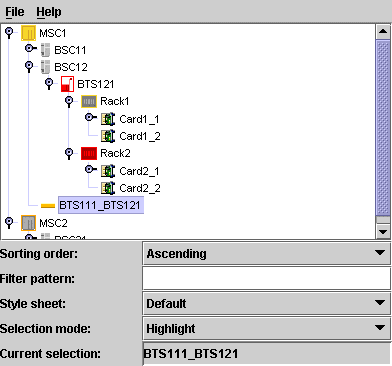
Tree nodes are graphically represented with a graphic object or icon and a label, as illustrated in the following example.
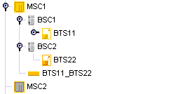
The default representation for business objects is a representation that combines a label with an optional icon, overlapping icon, and tool tip as illustrated in the following example.

Properties for customizing tree nodes
The following table lists the properties that are common to both predefined and user-defined business objects represented in a tree component.
|
Property Name |
Type of Value |
Default |
Description |
|
expansion |
IlpObject.ExpansionType |
IN_PLACE |
Determines whether an object should be expandable in the tree, so that its children can be displayed. Possible values are: IN_PLACE IN_PLACE_MINIMAL_LOADING NO_EXPANSION For details, refer to Customizing the expansion of business objects. |
|
focusBorderColor |
Color |
null |
Color to be used for the focus border of the node. The focus border shows which cell has the focus. If the value is null, the color of the active look-and-feel is used. |
|
focusBorderWidth |
Integer |
1 |
Width of the focus border, in pixels. |
|
icon |
Image |
null |
Icon to be displayed. If the value is null, no icon is displayed. |
|
iconVisible |
Boolean |
true |
Controls whether the icon is displayed or not. If this value is true and icon is null, a default icon will be displayed. |
|
label |
String |
null |
Text to be displayed for the label. If the value is null, the identifier of the business object is displayed. |
|
labelBackground |
Color |
null |
Color to be used for the label background. If the value is null, the color of the active look-and-feel is used. |
|
labelFont |
Font |
null |
Font to be used for the label. If the value is null, the font of the active look-and-feel is used. |
|
labelForeground |
Color |
null |
Color to be used for the label foreground. If the value is null, the color of the active look-and-feel is used. |
|
labelPosition |
IlvDirection |
Right |
Position of the label relative to the icon. Possible values are: Left Right Top Bottom Center |
|
labelSpacing |
Float |
2f |
Spacing between the label and the icon in pixels. |
|
labelVisible |
Boolean |
true |
Controls whether the label string is displayed or not. |
|
overlapIcon |
Image |
null |
Defines the image used for the overlap icon. |
|
overlapIconVisible |
Boolean |
true |
Determines whether the overlap icon is to be visible or not. |
|
selectionFocusMode |
IlpSelectionFocusMode |
CELL_SELECTION_FOCUS_MODE |
Determines the rendering of the selection and focus. Possible values are: CELL_SELECTION_FOCUS_MODE : select both icon and label. LABEL_SELECTION_FOCUS_MODE : select only the label. The third possible value for this property, BASE_SELECTION_FOCUS_MODE, is not recommended for use in the tree. |
|
toolTipGraphic |
IlvGraphic or JComponent |
null |
This property accepts IlvGraphic and JComponent objects that are created in CSS using @+, @=, or @# constructors. |
|
toolTipText |
String |
null |
Tooltip text for the cell, used only if toolTipGraphic is null. If the value of this property and the toolTipGraphic property are both null, no tooltip is displayed. |
Predefined business objects for tree nodes
By default, the predefined business objects for managed objects are displayed in the tiny representation. The tiny representation can be customized using the same CSS properties as for the symbolic representation (for example, foreground, background, label, labelPosition ).
For a list of the properties that you can customize of each type of predefined business object, refer to the following sections:
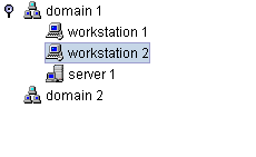
Objects of the IltNetworkElement and IltLink classes are represented as follows in a tree:
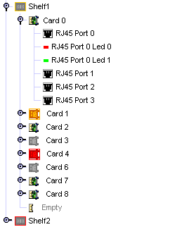
Objects of the IltShelf, IltCard, IltPort, and IltLed classes are represented as follows in a tree:
User-defined business objects
The default representation for user-defined business objects is a simple representation which combines a label with an optional icon, overlapping icon, and tool tip.
How to customize tree nodes
The following example shows you how you can customize the tree nodes. It is based on a CSS file.
The following CSS file is provided as part of the JViews TGO demonstration software at installdir/samples/tree/customClasses/data/tree.css.
The CSS selectors used to customize the nodes of the tree component are formed by the CSS type object and the CSS class <business class name>, as illustrated below:
object."NetworkElement" {
label : @name;
labelForeground : black;
iconVisible : true;
toolTipText : @name;
}
object."NetworkElement":selected {
labelForeground: red;
}
The example above illustrates a tree node configuration using pseudoclasses: the graphic representation of the nodes is based on the pseudoclass " selected ", so that the label foreground color changes whether the object is selected or not in the tree component.
Besides the selection state, you can also customize tree nodes according to the focus state or to custom pseudoclasses. The following example shows tree nodes whose label foreground color changes according to the focus and selection state:
object:selected {
labelForeground: red;
}
object:focus {
labelForeground: blue;
}
object {
labelForeground: black;
}
How to customize an overlapping icon
You can define an overlapping icon to be displayed over the default tree node icon.
To set an overlapping icon for all instances of a given business class, use the following style sheet extract:
object."Domain" {
overlapIcon: '@|image("overlap.png")';
overlapIconVisible: true;
}
Advanced customization of tree nodes
To further customize the tree node rendering, you may also:
-
Use an IlvGraphic to generate an arbitrarily complex graphic representation ( IlvCompositeGraphic). For more information about composite graphics, see the section on graphic objects in Architecture of graphic components.
-
Use a JComponent to generate a graphic representation and customize it using CSS.
-
Create your own renderer (which should implement the Swing TreeCellRenderer interface) to generate an arbitrary Swing Component.
How to use an IlvGraphic to generate a tree node representation
IlvGraphic instances can be used to represent tree nodes through the property 'class'. The given class must follow the JavaBeans™ pattern; its properties can be directly customized in CSS.
The following example illustrates the use of IlvCompositeGraphic to represent tree nodes.
object."Workstation" {
class: 'ilog.views.graphic.composite.IlvCompositeGraphic';
layout: @+attachmentLayout;
children[0]: @+wsBase;
children[1]: @+wsLabel;
constraints[1]: @+wsLabelConstraint;
}
Subobject#attachmentLayout {
class: 'ilog.views.graphic.composite.layout.IlvAttachmentLayout';
}
Subobject#wsBase {
class: 'ilog.views.graphic.IlvIcon';
image: '@|image("workstation.png")';
}
Subobject#wsLabel {
class: 'ilog.views.graphic.IlvText';
label: @name;
foreground: black;
font: 'arial-bold-12';
}
Subobject#wsLabel:selected {
foreground: red;
}
Subobject#wsLabelConstraint {
class: 'ilog.views.graphic.composite.layout.IlvAttachmentConstraint';
hotSpot: Left;
anchor: Right;
offset: 3,0;
}
For information about how to use JavaBeans in CSS and how to use the class property, refer to Class property.
How to use a JComponent to generate a tree node representation
The following example shows how to define a JComponent to generate a tree node representation. It is based on a CSS file.
The following CSS file is provided as part of the JViews TGO demonstration software at <installdir> /samples/tree/customClasses/data/tree.css.
In this example, tree nodes are represented using a simple JLabel whose properties text, icon and foreground are customized according to the business attributes and the selection state of the tree node.
object."Workstation" {
class: 'javax.swing.JLabel';
icon : @=icon;
text: @name;
foreground: black;
}
object."Workstation":selected {
foreground: red;
}
Subobject#icon {
class: 'javax.swing.ImageIcon';
image: '@|image("workstation.png")';
}
As illustrated in this example, JComponent instances can be used to represent tree nodes through the property 'class'. The given class must follow the JavaBeans pattern; its properties can be customized directly in CSS (icon, text, foreground).
For information about how to use JavaBeans in CSS and how to use the class property, refer to Class property.
Creating your own renderer
You may want to replace the JViews TGO tree node representation by your own representation. To do so, you need to create your own implementation of the Swing TreeCellRenderer interface. For details, refer to Using an arbitrary TreeCellRenderer.
You will then be able to register the new tree cell renderer in the tree component through CSS or through the API.
For information on how to set a new tree cell renderer through CSS, refer to The View rule.
For information on how to set a new tree cell renderer through the API, refer to Configuring the tree component.
Improving the performance of predefined business objects (tree component)
You can improve the rendering performance of predefined business objects by replacing their graphic representation with a static image.
How to improve performance in the Tree component by rendering predefined business objects as static images
By default, the representation of predefined business objects is generated from the tiny representation of the object. If the information about alarms and states is not important to your application, the performance of your application will be better if you replace the default representation by static images.
The following CSS example configures all ilog.tgo.model.IltObject business objects to be represented by the image myImage.png :
object."ilog.tgo.model.IltObject" {
icon: '@|image("resource/myImage.png")';
iconVisible: true;
}


