Customizing table cells
Describes the graphical representation of table cells and the ways of customizing them.
Describes the graphic representation of a table cell and how to customize it.
Describes how to use other classes for more complex representations of table cells.
Describes how to make the rendering of predefined business objects in tables faster.
Representing table cells as business objects or labels with optional icons
The default table cell renderer ( IlpTableCellRenderer) generates two default types of graphic representation for table cells:
-
The predefined business objects representation, where the main attributes are displayed using labels and icons, and the object representation is displayed as a compact version of the standard JViews TGO look seen in the network component. This compact version is also known as the object tiny representation.
-
A simple representation, combining a label with an optional icon.
Both of these representations can be customized through the use of style sheets.
Predefined business objects for table cells
Objects of the IltNetworkElement class are represented as follows in the table:
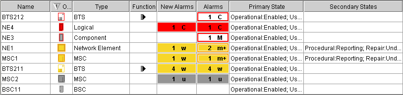
Objects of the IltLink class are represented as follows in the table:

Objects of the IltShelf class are represented as follows in the table:

Objects of the IltCard class are represented as follows in the table. (Objects of classes IltPort and IltLed differ only by the icon in the column “Object.”)
Objects of class IltAlarm are represented as follows in the table:
Simple representation for table cells
The simple representation is the default representation for user-defined business objects.
Properties for customizing table cells
The following table lists the properties involved in the table cell rendering.
|
Property Name |
Type of Value |
Default |
Description |
|
focusBorderColor |
Color |
null |
Color to be used for the focus border of the cell. The focus border shows which cell has the focus. The default color is the same as in a JTable. |
|
focusBorderWidth |
Integer |
1 |
Width of the focus border of the cell. |
|
horizontalAlignment |
SwingConstants |
Left |
Horizontal position of the label and icon in the cell. Possible values are: Center Left Right. |
|
icon |
Image |
null |
Icon to be displayed. By default, no icon is displayed. |
|
iconVisible |
Boolean |
true |
Determines whether the icon is displayed or not. |
|
labelBackground |
Color |
null |
Color to be used for the label background of a cell. By default, the color is white. |
|
labelFont |
Font |
null |
Font to be used for the label. By default, it is a sans serif font. |
|
labelForeground |
Color |
null |
Color to be used for the label foreground of a cell. By default, the color is black. |
|
labelInsets |
Integer |
1 |
Space in pixels around the label and icon. |
|
labelPosition |
IlvDirection |
Right |
Position of the label relative to the icon. Possible values are: Center Top Left Bottom Right. |
|
labelSpacing |
Float |
4 |
Spacing between the label and the icon. |
|
label |
String |
null |
Text to be displayed for the label. By default, no text is displayed. |
|
labelVisible |
Boolean |
true |
Determines whether the label is displayed or not. |
|
toolTipGraphic |
IlvGraphic or JComponent |
null |
This property accepts IlvGraphic and JComponent objects that are created in CSS using @+, @=, or @# constructors. |
|
toolTipText |
String |
null |
Tooltip text for the cell. By default, no tooltip string is displayed. |
|
verticalAlignment |
SwingConstants |
Center |
Vertical position of the label and icon in the cell. Possible values are: Center Top Bottom. |
How to customize the object column for predefined business objects in table cells
In the case of predefined business objects for managed objects, an Object column displays the value of the attribute graphicRepresentation. It shows the tiny representation of the business object displayed in the table row. To customize this tiny representation, you can use the same CSS properties as for the symbolic representation of the specific predefined business class (for example, foreground, background, label, labelPosition ). The following code extract:
object."ilog.tgo.model.IltNetworkElement" {
foreground: green;
}
changes the foreground color used in the tiny representation of network elements.
For a list of the properties that you can customize per type of predefined business object, refer to the following sections:
How to customize table cells
This use case shows you how to customize the cells of the table. The CSS selectors used to customize the table cells are formed by the CSS type object and the CSS class <business class name/attribute name>, as illustrated in the following example.
The following CSS file is provided as part of the JViews TGO demonstration software at <installdir> /samples/table/styling/data/table.css.
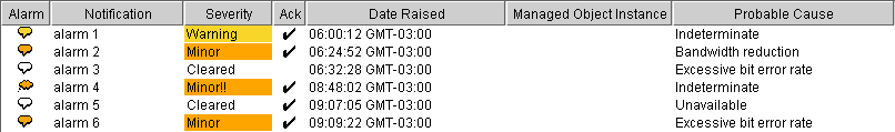
object."Alarm/perceivedSeverity"[perceivedSeverity=0] {
labelBackground: '#FFFFFF';
label: Cleared;
toolTipText: "Cleared alarm";
}
object."Alarm/perceivedSeverity"[perceivedSeverity=1] {
labelBackground: '#C0C0C0';
label: Indeterminate;
toolTipText: "Indeterminate alarm";
}
The example illustrates a table cell configuration based on the value of the attribute perceivedSeverity.
By means of cascading style sheets, you can also customize the table cell representation according to the focus and selection states. To do so, you use the pseudoclasses focus and selected, as follows:
object."ilog.tgo.model.IltObject/name":selected {
labelForeground: red;
}
object."ilog.tgo.model.IltObject/name":focus {
labelForeground: blue;
}
object."ilog.tgo.model.IltObject/name" {
labelForeground: black;
}
How to customize multiple table cells using wildcards
This use case shows you how to customize multiple cells of a table. The CSS selectors used to customize the table cells are formed by the CSS type object and the CSS class <business class name/attribute name>, as illustrated in the previous example. However, you can use the * wildcard to indicate that multiple attributes of a given business class should be configured using a single selector.
The following example illustrates how you can configure all cells of business class ilog.tgo.model.IltNetworkElement to have a blue background:
object."ilog.tgo.model.IltNetworkElement/*" {
labelBackground: blue;
}
You can also specify that all columns related to alarms should have a bold font:
object."ilog.tgo.model.IltObject/*larm*" {
labelFont: "arial-bold-12";
}
The following CSS extract can be found in a CSS file provided as part of the JViews TGO demonstration software at <installdir> /samples/table/styling/data/table.css.
This CSS extract configures the background of all the cells in the rows displaying objects of the business class Alarm according to the value of the perceivedSeverity attribute.
object."Alarm/*"[perceivedSeverity] {
labelBackground: '@|valuemap(@=perceivedSeverityBackgroundMap,
@perceivedSeverity)';
}
object."Alarm/*"[perceivedSeverity]:selected {
labelBackground: '@|valuemap(@=perceivedSeveritySelectionBackgroundMap,
@perceivedSeverity)';
}
Advanced customization of table cells
To further customize the table cell rendering, you may also:
-
Use an IlvGraphic to generate an arbitrarily complex graphic representation ( IlvCompositeGraphic). For more information about composite graphics, see the section on graphic objects in Architecture of graphic components.
-
Use a JComponent to generate a graphic representation and customize it using CSS.
-
Create your own renderer (which should implement the Swing TableCellRenderer interface) to generate an arbitrary Swing Component.
How to use an IlvGraphic to generate a table cell representation
IlvGraphic instances can be used to represent table cells through the property 'class'. The given class must follow the JavaBeans™ pattern; its properties can be directly customized in CSS.
The following example illustrates the use of IlvGeneralNode to represent table cells:
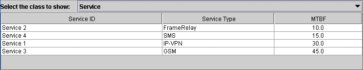
object."Service/type" {
class: 'ilog.views.sdm.graphic.IlvGeneralNode';
label: @name;
labelPosition: Right;
labelColor: black;
labelSpacing: 4;
shapeType: RECTANGLE;
shapeWidth: 12;
shapeHeight: 12;
}
object."Service/type":selected {
labelColor: red;
}
For information about how to use JavaBeans in CSS and how to use the class property, refer to Class property.
How to use a JComponent to generate a table cell representation
JComponent instances can be used to represent table cells in the same way as they are used to represent tree nodes (see How to use a JComponent to generate a tree node representation).
In the following example, table cells are represented using a simple JLabel whose properties text, icon and foreground are customized according to the business attribute and the selection state of the table cell.
object."Service/type" {
class: 'javax.swing.JLabel';
icon : @=icon;
text: @type;
foreground: black;
}
object."Service/type":selected {
foreground: red;
}
Subobject#icon {
class: 'javax.swing.ImageIcon';
image: '@|image("service.png")';
}
As illustrated in this example, JComponent instances can be used to represent table cells through the property 'class'. The given class must follow the JavaBeans pattern; its properties can be customized directly in CSS (icon, text, foreground).
For information about how to use JavaBeans in CSS and how to use the class property, refer to Class property.
Creating your own renderer for table cells
You may want to replace the JViews TGO table cell representation by your own representation. To do so, you need to create your own implementation of the Swing TableCellRenderer interface. For details, refer to Using an arbitrary TreeCellRenderer.
You will then be able to register the new table cell renderer in the table component through CSS or through the API.
For information on how to set a new table cell renderer through CSS, refer to The View rule.
For information on how to set a new table cell renderer through the API, refer to Configuring the tree component.
Improving the performance of table cell rendering
You can improve the rendering performance of predefined business objects by replacing their graphic representation with a static image.
How to improve performance in the table component by rendering predefined business objects as static images
The graphicRepresentation attribute of predefined business objects can be configured with the useDefaultCellRenderer CSS property so that predefined business objects are rendered as static images in the table component. This technique will improve performance as static images are faster to render than the alarm-colored tiny representation of predefined objects.
The following CSS example configures all ilog.tgo.model.IltObject business objects to be represented by the image myImage.png :
object."ilog.tgo.model.IltObject/graphicRepresentation" {
useDefaultCellRenderer: true;
icon: '@|image("resource/myImage.png")';
iconVisible: true;
}


