Customizing general links in the style sheet
Shows how to customize general links in the style sheet to affect its colors, borders, ends and joins, decorations, arrows, and hooks.
Lists the different ways that links can be customized.
Describes the properties used to control color effects in links.
Describes the properties used to control decoration in links
Describes the properties used to control arrow effects in links
Lists the used used to control extra effects in links.
Summarizes the properties used to control links
Controlling the link’s look
Controlling the link’s look involves:
In the description of each of these items, the figure shows three possible customizations and the code that follows the figure shows the style sheet setting for each customization in the same order.
Modes
The link has three major different looks, associated with the property mode. For the first and second looks, the foreground property sets the main color.
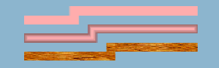
Three possible link modes
Example Basic link settings and three possible modes
link {
lineWidth : 10
foreground : pink ;
}
link.top {
mode : MODE_UNICOLOR ;
}
link.center {
mode : MODE_GRADIENT ;
}
link.bottom {
mode : MODE_TEXTURE ;
texture : 'file:/home/kaplan/JViews30/\
bin/composer/images/textures/wood2.gif' ;
}
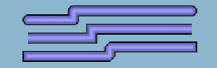
Adding a border
A border is painted when the borderWidth property is greater than 0, its default value. The default border color is black, and two other properties control the line style (for example, dashes).
Three possible link borders
Example Basic link properties and three possible borders
link {
lineWidth : 10 ;
foreground : 144,238,144 ;
endCap : CAP_BUTT ;
}
link.top {
borderWidth : 4 ;
borderUpColor : red ;
}
link.center {
borderWidth : 4 ;
borderUpColor : gray ;
borderStyle : 10,5 ;
}
link.bottom {
borderWidth : 2 ;
}
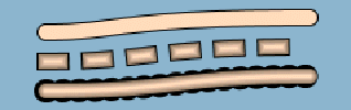
Different border effects
The border can have two colors: one for the upper edge and one for the lower edge.
Using two colors in link borders
Example Rounded two-color links
link {
lineWidth : 10 ;
endCap : CAP_ROUND ;
lineJoin : JOIN_ROUND ;
borderWidth : 4 ;
borderUpColor : white ;
borderDownColor : black ;
mode : MODE_UNICOLOR ;
}
link.top {
foreground : pink ;
}
link.center {
foreground : orange ;
borderStyle : 10,10 ;
}
link.bottom {
borderUpColor : yellow ;
borderDownColor : blue ;
foreground : 30, 200, 50 ;
}
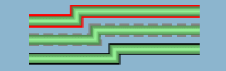
Line (stroke) ends and joins
IlvGeneralLink inherits from IlvPolylineLinkImage. The default stroke parameters are JOIN_MITER and CAP_SQUARE. A miter join is a sharp join formed by extending one edge of each link. You can change the end cap and join styles, as shown in the following figure.
Three possible end and join style combinations
Example Basic link properties and three possible end and join combinations
link {
lineWidth : 10 ;
foreground : 154,154,255 ;
borderWidth : 2 ;
}
link.top {
endCap : CAP_ROUND ;
lineJoin : JOIN_ROUND ;
}
link.center {
endCap : CAP_BUTT ;
lineJoin : JOIN_MITER ;
}
link.bottom {
endCap : CAP_SQUARE ;
lineJoin : JOIN_BEVEL ;
}
Curves
The curved property uses the link points to feed a Bezier function which renders a curved link. Intermediate points show the path for the Bezier computation. With two points, a standard deviation applies, that is, at 1/4 before the end of the link. The curved value is a floating-point value between 0f and 1f. A value of 0 means no curve at all (the default), and a value of 1 means the sharpest curve. Use a value of 0.65f for an attractive curve, see the following figure.
An attractively curved link
Example Basic line properties and a curve in three different line styles
link {
lineWidth : 10 ;
endCap : CAP_ROUND ;
lineJoin : JOIN_ROUND ;
foreground : 255,218,185 ;
borderWidth : 2 ;
curved : 0.65 ;
}
link.top {
mode : MODE_UNICOLOR ;
}
link.center {
endCap : CAP_SQUARE ;
lineStyle : 10,20 ;
}
link.bottom {
borderStyle : 1,10 ;
borderWidth : 6 ;
}
Dashes
Dashes provide interesting effects when combined with endCap values. Dashes are controlled by the lineStyle property. They are expressed as a float array. Alternate entries in the array represent lengths of the opaque and transparent segments of the dashes. Note that the lineStyle specification is not affected by zooming.
Note that the dash specification also applies to the border (as shown in the following figure) unless the borderStyle property overrides it (not shown).
Three uses of dashes for links
Example Basic link properties and three links with dashes (one a curve)
link {
lineWidth : 10 ;
endCap : CAP_BUTT ;
lineJoin : JOIN_ROUND ;
borderWidth : 2 ;
}
link.top {
foreground : #55BEF3 ;
lineStyle : 1,15 ;
}
link.center {
foreground : orange ;
lineStyle : 10,8,20,8 ;
}
link.bottom {
foreground : red ;
mode : MODE_UNICOLOR ;
endCap : CAP_BUTT ;
lineStyle : 4,4 ;
curved : 0.65 ;
}
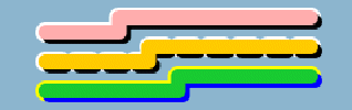
Obtaining color effects
The alternateColor property gives the link a striped appearance. The length of each stripe is equal to the thickness of the link by default. You can specify a different stripe length with the lineStyle property.
The lineStylePhase property sets the initial offset. If no lineStyle is specified, the phase is proportional to twice the line width. In the following example, the bottom link starts the alternate color one segment later than the top one.
Three curved links with stripes
Example Striped links
link {
lineWidth : 10 ;
foreground : yellow ;
endCap : CAP_BUTT ;
lineJoin : JOIN_ROUND ;
alternateColor : darkGray ;
borderWidth : 2 ;
curved : 0.65 ;
}
link.top {
}
link.center {
lineStyle : 4,3 ;
}
link.bottom {
mode : MODE_UNICOLOR ;
lineStylePhase : 1 ;
}
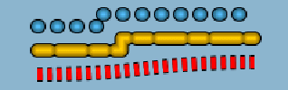
Controlling link decorations
IlvGeneralLink allows you to place an IlvGraphic object onto a link, at a relative position. You can place the decoration above the link or beside the link (the default).
Note that the syntax to enter the decorationPosition value is an array. You can enter all the values at once as a comma-separated list of values or enter the array elements one by one.
Another array property, decorationOptions, alters the way in which the decoration is displayed. This property is a bit set of values, so you can specify several options at the same time using the vertical bar operator | as follows:
-
DECORATION_NOTHING : Means default values (zoomable, no rotation, no animation).
-
DECORATION_FIXED_SIZE : If set, the decoration will not zoom.
-
DECORATION_ANIMATE : If set, the decoration will move along the link. The speed is defined by the property animateSpeed.
-
DECORATION_ROTATE : If set, the decoration is rotated to follow the link shape.
When the option DECORATION_ROTATE is set, you can tune the behavior of the rotation angle by combining it, using the vertical bar operator (|), with one of the following options:
-
DECORATION_PROPORTIONAL_ANGLE : To rotate the decoration proportional to the slope of the link. This may be unsuitable for labels, because if the link is rotated 180 degree, label decorations appear upside down and may be difficult to read.
-
DECORATION_RIGHT_SIDE_UP_ANGLE : To rotate the decoration by an angle that keeps the decoration right-side up. This can be useful for labels but may be unsuitable for decorations such as arrowheads.
To place the decoration over the link, set the option DECORATION_OVER, then set additional options to control the position of the decoration with respect to the center of the link:
-
DECORATION_ANCHOR_TOP : Shifts the decoration below the link at the center.
-
DECORATION_ANCHOR_BOTTOM : Shifts the decoration above the link at the center.
-
DECORATION_ANCHOR_LEFT : Shifts the decoration to the right of the link at the center.
-
DECORATION_ANCHOR_RIGHT : Shifts the decoration to the left of the link at the center.
It is possible to mix options: DECORATION_ANCHOR_TOP|DECORATION_ANCHOR_LEFT places the top-left corner of the decoration at the link center. The default behavior places the center of the decoration at the center of the link, and you can apply an offset with the x, y values for the decoration bounding box.
The following figure shows three decorations, one is a label and two are icons on the same link.
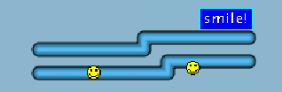
Decorations on Links
Example Decorations on links
link {
foreground : #55BEF3 ;
lineWidth : 10 ;
endCap : CAP_ROUND ;
lineJoin : JOIN_ROUND ;
borderWidth : 2 ;
}
link.top {
decorations[0] : @#label ;
decorationPositions : 0.9 ;
}
link.center {
visible : false
}
link.bottom {
decorations[0] : @#smiley ;
decorations[1] : @#smiley ;
decorationOptions[0] : DECORATION_OVER ;
decorationOptions[1] : DECORATION_OVER|DECORATION_ANCHOR_TOP ;
decorationPositions : 0.25,0.75 ;
}
Subobject#label {
class : 'ilog.views.sdm.graphic.IlvGraphicFactories$ZoomableLabel' ;
label : "smile!" ;
antialiasing : true ;
leftMargin : 5 ;
rightMargin : 5 ;
topMargin : 5 ;
bottomMargin : 5 ;
foreground : white ;
borderOn : true ;
stroke : @=stroke ;
strokePaint : @=borderPaint ;
backgroundOn : true ;
backgroundPaint : @=bgPaint ;
}
// border is cyan
Subobject#borderPaint {
class : ilog.views.sdm.graphic.IlvPaint ;
color : cyan ;
}
// background is blue
Subobject#bgPaint {
class : ilog.views.sdm.graphic.IlvPaint ;
color : blue ;
}
// stroke for the text
Subobject#stroke {
class : ilog.views.sdm.graphic.IlvBasicStroke ;
lineWidth : 1 ;
}
// smiley icon
Subobject#smiley {
class : "ilog.views.sdm.graphic.IlvGraphicFactories$Icon"
IlvRect : 0,0,12,12 ;
imageLocation : file:smiley.gif ;
}
Note the convenient property called label that quickly accesses the first decoration implementing the IlvLabelInterface. If no decoration is found, a simple IlvZoomableLabel is created at the first available slot of the current decorations array.
Controlling arrows
You can set one of four modes on a link to represent an arrow:
-
The ARROW_FILL mode value (the default) draws a filled triangular arrowhead.
-
The ARROW_OPEN mode value draws a two-winged arrow.
-
The ARROW_GRADIENT mode value shows an oriented link by smoothly varying the luminosity along the link. The link appears darker near the source object and brighter near the destination object.
-
The ARROW_DECORATION mode value delegates the task of displaying the arrow to one of the link decorations.
Drawing an arrow
In the first two modes, the arrowPosition property controls the position of the arrowhead along the link. Its value is a floating-point value between 0 and 1. A value of 0 means the start of the link, and 1 means the end (the default). The arrow direction is obviously aligned with the link segment to which it is attached.
The property arrowRatio controls the size of the arrow, which is proportional to the link width. A floating-point value of 0.5 means the arrow has the same size as the link. The default value, 1, means the arrow is twice the link width. This property only makes sense for the first two arrow modes.
The default color for an arrow is black, but you can set a different color with the property arrowColor.
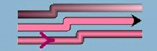
Arrowheads and direction
Example Basic link properties and three ways to show direction
link {
lineWidth : 10 ;
endCap : CAP_BUTT ;
lineJoin : JOIN_ROUND ;
foreground : 255,130,171 ;
borderWidth : 2 ;
oriented : true ;
}
link.top {
arrowMode : ARROW_GRADIENT ;
}
link.center {
mode : MODE_UNICOLOR ;
arrowPosition : 1f ;
arrowMode : ARROW_FILL ;
}
link.bottom {
arrowColor : #A3056E ;
arrowPosition : .2 ;
arrowMode : ARROW_OPEN ;
}
Using a decoration as an arrowhead
The ARROW_DECORATION mode value delegates the responsibility for showing an arrow to a decoration.
IlvGeneralLink can help display a particular kind of arrow, for example, the kind used in UML drawings.
The arrowhead is a simple shape (such as a circle, triangle, or diamond), located at the end of the link. The link does not overlap the shape, nor go to the middle of the shape, nor change at all. Whatever the direction of the last link segment touching the target node, the shape is always toward the link. Since the decorations are IlvGraphic objects, that is, basically rectangular objects, this special mode gives better results with orthogonal links.
You can only use this mode if the following conditions are met:
-
The arrowMode property is set to ARROW_DECORATION.
-
One of the link decorations has its position set to 1.
-
This decoration sets the option DECORATION_OVER.
-
This decoration sets one of the options DECORATION_xxx_RETRACT_AT_END,
where xxx can be FULL, HALF, or NO.
The following figure shows an example of two links in ARROW_DECORATION mode, connected to a square node. The horizontal link is ended by a circle; the line continues to the middle of the circle. The vertical link is ended by a diamond; the line stops at the beginning of the diamond.
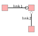
Two decoration arrowheads
The following code example shows the styling rules used to generate the node, links and arrowheads.
Example Decorations as arrowheads on links to a node
/////////////
// A very simple node
node {
class : ilog.views.sdm.graphic.IlvGeneralNode
fillColor1 : pink;
foreground : gray;
}
////////////
// Link definition
link {
class : ilog.views.sdm.graphic.IlvGeneralLink;
oriented : true;
decorations[1] : @=arrow; // see Subobject#arrow
decorationPositions[1] : 1;
decorationOptions[1] : 'DECORATION_OVER|DECORATION_HALF_RETRACT_AT_END';
arrowMode : ARROW_DECORATION;
label : @id;
lineWidth : 1.5;
endCap : CAP_BUTT;
foreground : black;
}
Subobject#arrow {
class : ilog.views.sdm.graphic.IlvGraphicFactories$Ellipse;
IlvRect : 0,0,10,10; // a circle
}
///////////////
// The vertical link inherits from "link { ... }" rule, and
// overwrites some options
#link2 {
decorations[1] : @=arrow2; // see Subobject#arrow2
decorationOptions[1] : 'DECORATION_OVER|DECORATION_FULL_RETRACT_AT_END';
}
Subobject#arrow2 {
class : ilog.views.sdm.graphic.IlvGraphicFactories$Marker;
IlvRect : 5,5,5,5;
type : 2; // a diamond
}
Controlling extra effects
The extra effects available for a link are:
Waves
The wave effect is very effective for representing a wireless connection. The wave specification consists of two numbers: the wave amplitude and its period, in pixels. The property type is a String where two integers separated by “/” represent, respectively, amplitude and period. The effect renders best with straight lines but remains compatible with any shape.
The wave effect can also be mixed with dashes, border, arrow, and so on.
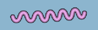
The wave effect for a link with a border
Example Basic link properties and the wave property
link {
lineWidth : 10 ;
endCap : CAP_ROUND ;
lineJoin : JOIN_ROUND ;
foreground : 238,174,238 ;
borderWidth : 2 ;
}
link.top {
visible : false ;
}
link.center {
borderWidth : 2 ;
wave : 20/30 ;
}
link.bottom {
visible : false ;
}
Animation
You can animate a link with dashes (see the lineStyle property) or alternate colors (see the alternateColor property). The animation consists of incrementing the lineStylePhase value at regular intervals, so that the pattern is shifted at each animation frame. The current implementation updates the pattern every 500 ms.
The animateSpeed property controls animation of the link and how much the phase is incremented. If the value is 0, the animation is stopped. Otherwise, the value must be between 0f and 1f, and represents a fraction of dash pattern length. For example, 0.1 means that ten frames pass before you see the first frame again. Note that 0.9 represents the same increment but in the backward direction.
Zoom
IlvGeneralLink inherits from IlvLinkImage, and keeps its zoom behavior. In particular, the maximumLineWidth property sets the maximum size of the line. Also, the link is zoomable only if one edge node is zoomable. Note that the link border thickness does not zoom. The border line style and the link line style follow the zoom level of the link.
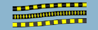
Neon effect and road effect
MODE_NEON is a minor mode which is a variation of MODE_GRADIENT. It displays the link with transparent colors, giving a glowing effect (this works best with larger links and with darker backgrounds). The border is automatically disabled in this mode. An example of using Neon mode is to mark link selection, as shown in the top link in figureThe wave effect for a link with a border. (The second link shows the same link when it is not selected.)
Previous examples already demonstrated some of the many possibilities that the link appearance offers. By combining some of the properties, you can achieve some fancy effects, such as the “road” link in figure The wave effect for a link with a border, where the large border is the same gray color as the link foreground, and the white alternateColor looks like the middle line of a road.
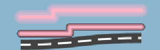
The neon effect
Example Selected (neon) and not selected links, and a road link
link {
lineWidth : 10 ;
lineJoin : JOIN_ROUND ;
endCap : CAP_ROUND ;
foreground : 255,181,197 ;
}
link.top {
mode : MODE_NEON ;
lineWidth : 20 ;
}
link.center {
borderWidth : 1 ;
}
link.bottom {
mode : MODE_UNICOLOR;
endCap : CAP_BUTT ;
lineWidth : 15 ;
foreground : darkGray ;
lineStyle : 20,10;
lineStylePhase : 5 ;
alternateColor : white ;
borderWidth : 12 ;
borderUpColor : darkGray ;
curved : 0.65 ;
}
Summary of link properties
The following table lists all available properties of IlvGeneralLink and their descriptions.
|
Property Name |
Type |
Effect |
Default |
Comment |
|
alternateColor |
Color |
alternate colored segments |
null |
Segment colors are foreground and alternateColor. Segments are the width of the link unless the lineStyle property is specified. |
|
arrowColor |
Color |
color of arrow |
Color.black |
Sets the arrow color; the default is black. |
|
arrowMode |
int |
style of arrow |
ARROW_FILL |
ARROW_FILL gives a filled triangular shape, ARROW_OPEN gives a 2-arms shape, and ARROW_GRADIENT gives a lighter color near the target. Set oriented to enable an arrow. ARROW_DECORATION delegates the display of the arrow to a decoration. |
|
arrowPosition |
float |
position of arrow |
1f |
ARROW_FILL and ARROW_OPEN modes only. It sets the position of the arrow along the link. The default is 1f, that is, at the target of the link. When exactly at 1f, the link is not painted until the very end, so it does not overlap the link. |
|
arrowRatio |
float |
relative size of the arrow |
1f |
ARROW_FILL and ARROW_OPEN modes only. It sets the size of the arrow according to the link width. The ratio value is multiplied by twice the link width to obtain the arrow size. |
|
borderDownColor |
Color |
border down color |
null |
The down side color of the border. |
|
borderStyle |
float [ ] |
dash style |
null |
Overrides lineStyle if defined. |
|
borderStylePhase |
float |
dash offset |
0f |
Overrides lineStylePhase only when borderStyle is defined. |
|
borderUpColor |
Color |
border color |
null |
The color of the border. If borderDownColor is specified, it affects only the upside border of the link. |
|
borderWidth |
float |
border width |
0f |
The width of the link border. |
|
curved |
float |
curved lines |
0f |
Inner points are Bezier control points. For 2 points, a standard deviation is applied. Values below 0f and over 1f are ignored. Set to 0 to disable curves, use 0.65 for best results. |
|
decorations |
ilog.views.IlvGraphic[] |
puts IlvGraphic onto the link |
null |
Style sheet entry can be a @# construct that generates an IlvGraphic (works only with an indexed setter). |
|
decorationPositions |
float[ ] |
sets relative location of the decorations |
null |
Values are between 0.0 and 1.0. |
|
decorationOptions |
int[ ] |
displays options for decorations |
null |
Options are: DECORATION_NOTHING for default, an OR-ed set of DECORATION_ANIMATE to enable animation according to animateSpeed value, DECORATION_ROTATE to rotate the decoration according to the link shape, or DECORATION_FIXED_SIZE to prevent the decoration from zooming. For a decoration over the link, use DECORATION_OVER and DECORATION_ANCHOR_[TOP|BOTTOM|LEFT|RIGHT] to set the position of the decoration with respect to the link center. DECORATION_[FULL | HALF | NO]_RETRACT_AT_END] is used in ARROW_DECORATION special mode to display the decoration at the end of the link. |
|
endCap |
int |
link termination (and dashes) style |
CAP_SQUARE |
See IlvStroke. |
|
foreground |
java.awt.Color |
main color |
null |
Value may be a decimal triple, #-form, or any of the standard Java™ colors, for example, 12,55,200, #E023B3, cyan. No alpha is allowed. |
|
label |
String |
link label |
null |
Convenient property to access the first decoration that is a label. If none is found, an IlvZoomableLabel is created at the first available slot in the decoration array. |
|
lineJoin |
int |
corner style |
JOIN_MITER |
See IlvStroke. |
|
lineStyle |
float [ ] |
dash style |
null |
See IlvLinkImage. |
|
lineStylePhase |
float |
dash offset |
0f |
See IlvLinkImage. |
|
lineWidth |
float |
line width |
0f |
The width of the link (border excluded). |
|
minimumLineWidth |
float |
zoom min. width |
0f |
The minimum width of the link. |
|
maximumLineWidth |
float |
zoom max. width |
0f |
See IlvLinkImage. |
|
mode |
int |
main look |
MODE_GRADIENT |
MODE_UNICOLOR displays the foreground color; MODE_GRADIENT displays a brightness gradient derived from the foreground, giving the look of a pipe; MODE_NEON displays a transparent gradient derived from the foreground, giving the look of a flashy neon; and MODE_TEXTURE displays the texture from the texture property. |
|
oriented |
boolean |
flag |
false |
True enables an arrow. |
|
texture |
IlvTexture |
texture |
null |
The texture for MODE_TEXTURE. The property editor expects a URL to build the texture, so use the string representation of a URL in the style sheet to set this property. |
|
visible |
boolean |
show the link |
true |
|
|
wave |
String |
wavy stroke |
0/0 |
First part is the amplitude, second part is the period. It works best with direct lines. |


