Rogue Wave JViews TGO Sample: Network Component - Decoration
Description
 |
This sample shows how to extend predefined business objects and how to represent the new information in your object using the Rogue Wave JViews TGO network component.
How to Use the Sample
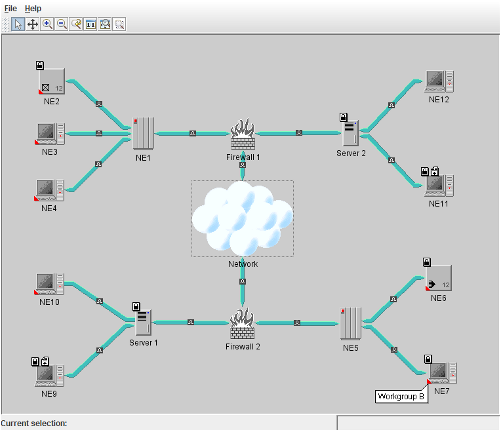
The main frame contains a simple network component, with several different types of nodes and links. A network component has a default toolbar with a set of predefined interactors:
- Select
- Pan
- Reset Zoom
- Zoom In
- Zoom Out
- Zoom on a Rectangle
- Fit to Contents
How to Run the Sample as an Application
This sample can also be run as an application. The installation directory contains an executable JAR file, network-decoration.jar, that allows you to execute the sample with a double click from a file browser. Note that if you are using Internet Explorer, you can open the installation directory and execute the JAR file from the browser. This technique may not work in other Web browsers.
Alternatively, you can run the sample application from the command line. First check that the Ant utility is properly configured. If not, see the instructions on how to configure Ant for Rogue Wave JViews.
Then, go to the installation directory of the sample and type:
ant run
Topics Covered
- Basic initialization
See thenetwork/basicsample for details.
- Creating custom business classes.
- Mapping attributes of custom classes to new decorations of network nodes by using cascading style sheets.
- Adding interactors to custom business attributes by using cascading style sheets.
- Customizing the visibility threshold for new decorations.
- Customizing the layer policy for new decorations.
Detailed Description
This sample differs from the basic sample in that it shows instances of a custom business class that extends the predefined business class ilog.tgo.model.IltNetworkElement.
This new class defines a business attribute, called comments, which is used to illustrate how to add new decorations to a predefined business object graphic representation. The new business class is declared and instantiated in customClasses.
The comments attribute is mapped to a decoration by using a style sheet. New decorations for predefined business objects are customized using the following properties:
-
children: an indexed property which contains the new decorations added to the object -
constraints: an indexed property which defines how the decorations are attached to the object graphic representation.
These properties are illustrated in network.
In this example, the attribute comments is graphically represented as a small red triangle, which is added to the bottom left of the network element. This decoration is only added to the object if the attribute value is set.
When you click the new icon decoration, a comment window is displayed showing the value of the attribute value. This window is customized using cascading style sheets.
Tooltips can also be defined using the following properties:
-
toolTipText: for textual tooltips -
toolTipGraphic: for tooltips displaying graphic objects, such as anIlvGraphicor aJComponent.
New decorations can also be customized to be placed in specific layers or to have different visibility thresholds which make them invisible according to the zoom level. In order to enable these configurations, the decoration must be identified by a decoration name. The steps to assign a decoration name are listed below:
- Create your own decoration name: decoration names are instances of the class ilog.tgo.graphic.IltGraphicElementName. To do so, create a new instance of this class providing a unique name, as illustrated in method
initTelecom()of decoration.Main - In the style sheet file, define the
ILPDECORATIONNAMEproperty.
The following example illustrates the style sheet configuration for the new comments decoration:
#commentIcon {
  class: 'ilog.views.graphic.IlvIcon';
  image: '@|image("commentIcon.png")';
  ILPATTRIBUTE: "comments";
  ILPDECORATIONNAME: "Comments";
}
Once the decoration has been identified with the decoration name, it is possible to customize its layer by creating a new layer policy. The layer policy defines the layer in which each decoration of an object representation will be placed. This is illustrated in decoration.CustomLayerPolicy.
The visiblity threshold of the decoration can be specified also in the style sheet configuration when the zoom policy is Physical or Mixed. This configuration is achieved using properties decorationNames and visibilityThresholds, as illustrated below:
Zooming {
  type: "Physical";
  decorationNames[0]: Comments;
  visibilityThresholds[0]: 0.5;
}
Installation Directory
The Network Component - Decoration sample is installed here.
Classes Involved
-
ilog.tgo.IltSystem
The class that initializes a JViews TGO application.
-
ilog.tgo.datasource.IltDefaultDataSource
The default datasource implementation.
-
ilog.cpl.IlpNetwork
The network component.
-
ilog.tgo.model.IltNetworkElement
The network element business object.
-
ilog.tgo.graphic.IltCompositeGrapher
The grapher support for network components.
-
ilog.tgo.graphic.IltLayerPolicy
The layer policy implementation.
-
ilog.tgo.graphic.IltGraphicElementName
The enumeration that lists the names of elements of graphic objects, used by the layer policy and zoom policy visibility threshold.
-
ilog.views.graphic.composite.IlvCompositeGraphic
The composite graphic implementation.
-
ilog.views.graphic.composite.layout.IlvAttachmentLayout
The layout implementation to attach decorations in a composite graphic.
-
ilog.views.graphic.composite.layout.IlvAttachmentConstraint
The attachment contraint to place decorations in a composite graphic.
-
ilog.views.graphic.IlvText
The text graphic.
-
ilog.views.graphic.IlvIcon
The icon graphic.
-
ilog.views.graphic.composite.decoration.IlvRectBalloon
The rectangular balloon graphic.
Source Files
-
decoration.Main
The entry point of the sample.
-
decoration.CustomLayerPolicy
The layer policy that takes into account the new decorations.
-
decoration.ToggleCommentWindowAction
The action that toggles the visibility of the comment decoration.