Creating a new basic chart
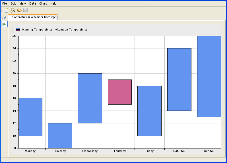
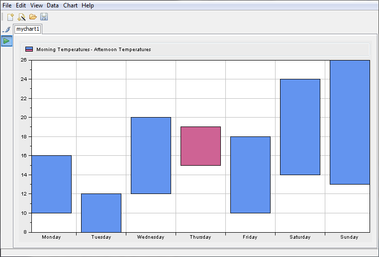
You are going to create a new basic Cartesian chart which displays the morning mean temperatures and the afternoon mean temperatures for each day of the week. The days will be plotted along the abscissa scale and the temperatures along the ordinate scale, as illustrated in
Basic Cartesian Chart. The example is based on XML data contained in the
temperatures.xml file.
Basic Cartesian Chart
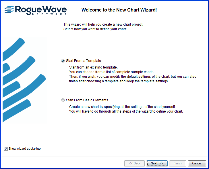
To create a new chart, use the New Chart Wizard. This wizard may be open on startup. If not, choose File>New from Wizard.
In this example you will go through the following steps:
Choosing between template and basic elements

Select the option Start From Basic Elements and click the Next button.
The New Chart Wizard gives you a choice between:
Start From a Template
Start From Basic Elements
Click Start From Basic Elements and Next.
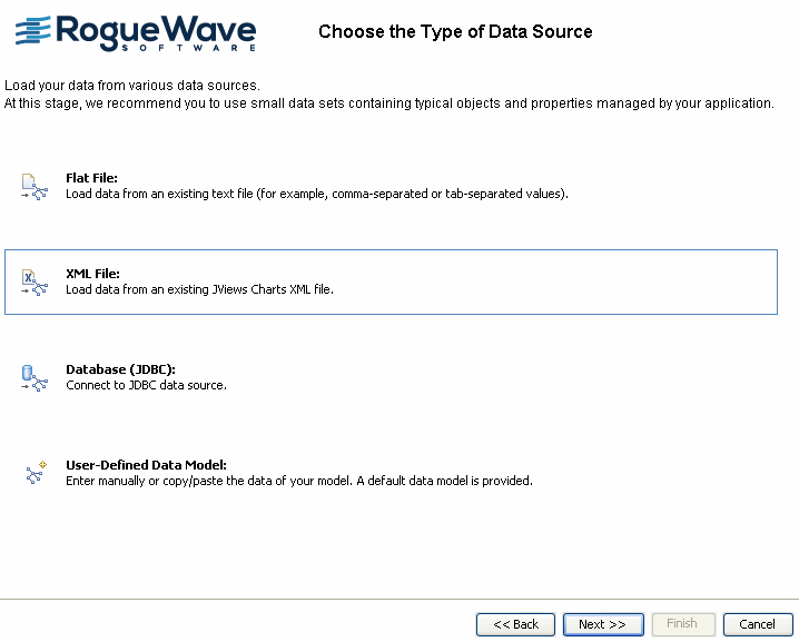
Choosing the type of data source
Select the option to connect to the XML file and click
Next.
The New Chart Wizard gives you a choice of the following data sources:
Flat file, for example, Excel file in CSV (comma-separated values) format
XML file
Database supported by JDBC (Java™ Database Connectivity), for example, Microsoft® Access
User-Defined Data Model
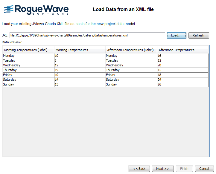
Loading your data
The data to be represented is the morning and afternoon mean temperatures (expressed in degrees Celsius) recorded for each day of the week. The data series is composed of categories.
1. The example presented in this section is located in:
To load your data you can either:
click
Load and browse to the directory containing the
temperatures.xml file.
or
enter in the URL field the path and the name of the file you want to load and click
Refresh.
Data contained in the temperatures.xml file is displayed in the Data Preview area.
2. Click Next to continue.
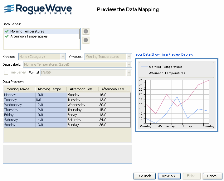
Previewing the data mapping
In this example, the data is already mapped. This window presents the data mapping as it is defined in the temperatures.xml file.
1. Click one of the series in the Data Series table to see the corresponding mapping in the Data Preview table.
2. Click Next to continue.
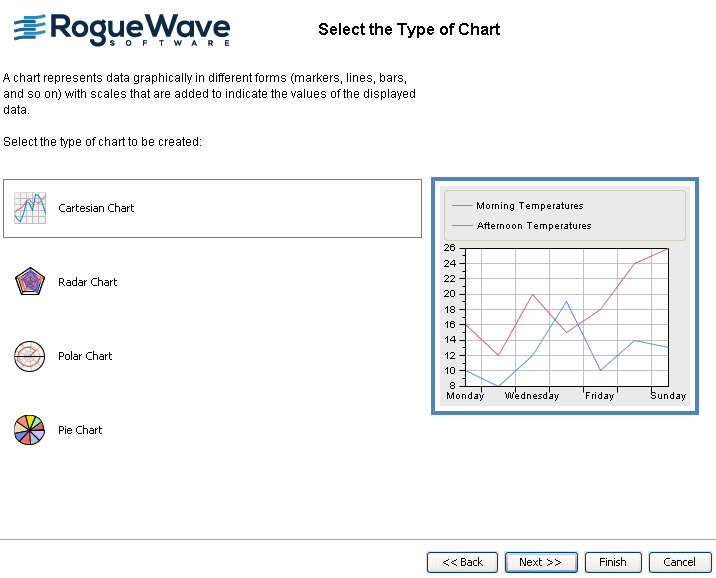
Selecting the type of chart
At this step you define the type of chart you want to create.
It is possible to create four different types of chart: Cartesian, Radar, Polar and Pie. To choose one of these types, click the corresponding icon.
1. Select the option Cartesian Chart.
2. Click Next to continue.
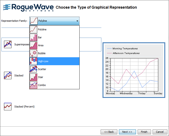
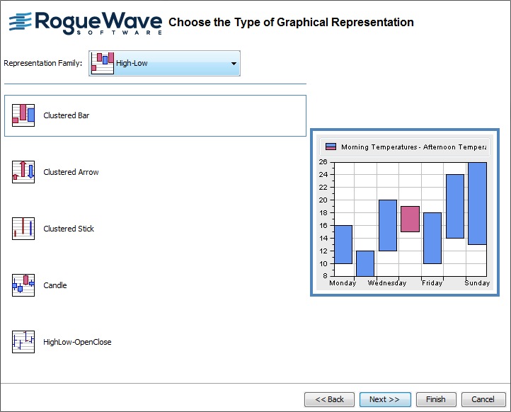
Choosing the type of graphical representation
You are going to display the two sets of temperatures with two polylines and with a High-Low bar representation, which represents both the data sets of the morning and afternoon mean temperatures.
The first polyline represents the data set of the morning mean temperatures and corresponds to the first series of values in the data source. The second polyline represents the data set of the afternoon mean temperatures, which corresponds to the second series of values in the data source.
1. Choose High-Low from the Representation Family combo-box.
2. Select the Clustered Bar

option and click the Next button to continue.
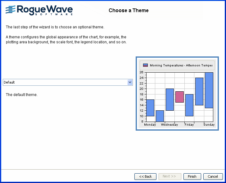
Choosing a theme
A theme consists only of a style sheet. It is a convenient way of applying a common look that you want to reuse in different projects.
The default themes provided with the Designer only contain static styling rules (no data styling) and do not change the setting you could have set in the previous steps.
Leave the Default theme and click the Finish button.
This was the last step of the Wizard.
Viewing the final chart
Here is how the Cartesian chart should appear:
Copyright © 2018, Rogue Wave Software, Inc. All Rights Reserved.