Creating the File Pop-up Menu
To create the pop-up menu for the File item in the menu bar, follow these steps:
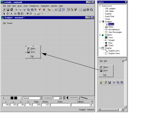
1. In the Palettes panel, select the Menus palette under Gadgets. Drag a pop-up menu gadget to the Gadgets buffer, leaving it selected.
2. Double-click the pop-up menu gadget in the buffer window to display its inspector.
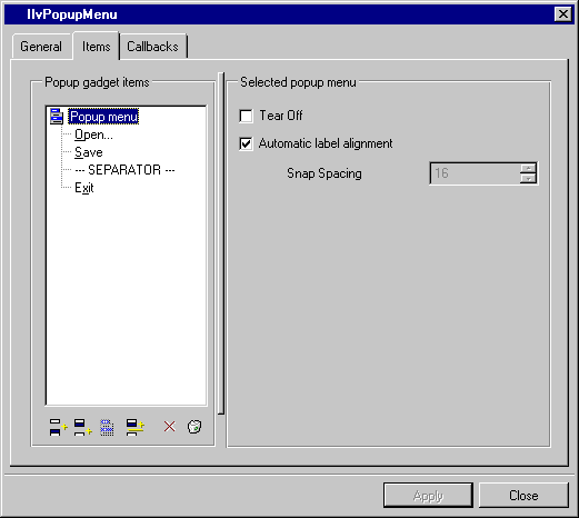
The IlvPopupMenu inspector appears.
Note: Your actions do not affect the pop-up menu in the buffer window until you click Apply in the inspector. |
3. Make sure you are on the Items notebook page. In the Popup gadget items tree on the left side of the page, click ---SEPARATOR--- to select it.
Click the Remove button

under the Popup gadget items tree.
The ---SEPARATOR--- item is removed from the tree gadget in the inspector.
4. Click
Open in the inspector panel to select it. Then click the Remove button
.
The Open menu item is removed from the tree gadget in the inspector.
5. Click
Save in the inspector panel to select it. Then click the Remove button
.
The Save menu item is removed from the tree gadget in the inspector.
6. Click Exit in the inspector to select it.
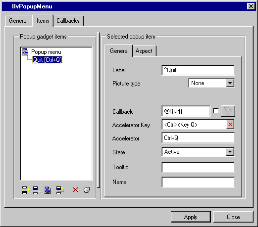
7. In the General notebook page on the right side of the inspector, change the Label field.
Replace the existing text with ^Quit. (The “^” symbol makes the letter following it underlined, thus highlighting the keyboard equivalent of the command).
The remaining pop-up menu item in the tree gadget becomes Quit.
8. Type @Quit() in the Callback field.
By using this predefined callback, you can quit the application without coding. For more information, see the section
Using Predefined Callbacks.
9. Go to the Accelerator Key field. Press the CTRL key and the Q key at the same time.
When you do this, you will see that <Ctrl><Key Q> appears in the Accelerator Key field, Ctrl+Q appears in the Accelerator field, and Active appears in the State field. These are the actual keys used to execute the accelerator.
The IlvPopupMenu inspector now looks like this:
Notes: 1. An accelerator allows you to immediately call a callback function (in this case, to quit the application) by pressing the keys defined in the Accelerator Key field. An accelerator is a mechanism that establishes a connection between an event and a function. When a predefined event takes place, such as pressing a key, Data Access recognizes the event and calls the associated function 2. The Picture type field allows you to load and display an icon in place of a label for the menu item. When you select Bitmap from the combo box, you can specify the name of a file containing the icon to be displayed. You will not use this feature in the tutorial. |
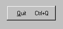
10. Click Apply in the IlvPopupMenu inspector to have your changes take effect in the current Gadgets buffer window. The button should now appear like this:
11. This step will allow you to see other options you can use for your menu items. It is provided for your information only. For this tutorial, you will want to return the options in their default state once you have tried them to see how they work.
Select Quit(Ctrl+Q) in the Popup gadgets items on the left side of the inspector panel. You can then use the notebook pages of the Selected popup item box to specify other options.

In the General page, the State combo box contains a list of options that you can use with the selected item:
Active When you select this option, the menu item can be activated and appears in normal font in the menu. This is the default behavior.
None selectionable When you select this option, the menu item cannot be activated, but it is not grayed. The menu item cannot be chosen. You can use this option to make a title within a menu.
Grayed When you select this option, the menu item is dimmed and cannot be chosen.
You can try out these options by selecting the option and then clicking Apply in the inspector panel. Then go to the Main window to see the results. To see the results of the None selectionable option, you will have to be in Active mode. When you have finished, make sure you return the State setting to Active.
The Aspect page contains several options that you can use for the display of the item:
Toggle and Radio These buttons let you choose the type of check mark that appears when the item is checked. The behavior depends on the look and feel. With Windows and Windows 95, nothing is displayed when the item is not checked. With Motif, a check box is displayed even if the item is not checked and that check box is inverted when the item is checked.
Checked When you select this option, a symbol appears next to the item in the menu.
Again, you can try out these options, by selecting them and clicking Apply in the inspector panel. Make sure you return them to their original setting before continuing with the tutorial.
You have now finished creating the File popup menu and will attach it to the File menu in the menu bar.
Version 6.0
Copyright © 2015, Rogue Wave Software, Inc. All Rights Reserved.