
Several important Objective Views concepts are defined in this section.
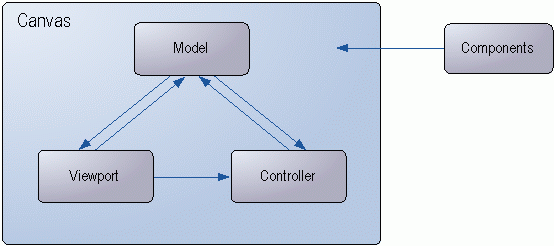
A canvas is a drawing surface for a set of components. It has a size, a coordinate system, a set of components, and several other attributes that you can configure. The canvas consists of three pieces – the model, the viewport, and the controller. The model is the container for the components; the viewport maps the components to a region of a window and renders; the controller handles messages and user interaction within the canvas. Conceptually, think of the canvas as a surface that comprises the model, viewport, and controller.

The viewport presents information stored in a model. It is an observer of the model and knows how to render the model onto a device context. Whenever the model is notified of a change by the controller, the viewport or viewports update themselves accordingly.
A model is a collection of components, symbols and links that show a complete system of graphical objects and their relationship to each other.
A controller is an object that handles messages and user interaction. It receives messages from the viewport and interprets them as user tasks or activities. The controller is responsible for translating the messages into commands or actions that affect the model, viewport, or both.
A component is an object that is drawn onto a canvas. Lines, text, ellipses, and rectangles are examples of components. Components have a logical position, occupy a rectangular area on the canvas, and are responsible for drawing themselves onto the canvas. You can assign a component properties such as fill color, line color, font, and boolean flags to determine its appearance and behavior.

A composite is a component that contains child components. It consists of a group of components that act as a unit. Moving, rotating, or scaling the composite affects the children it contains. The children of a composite can inherit the properties that belong to the composite or parent component. When a component is added as a child to a composite, its properties may be altered slightly by the parent component. For example, you cannot edit the vertices of a component when it is a child of a composite component.

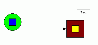
A connection binds two ports and establishes a connection between two symbols. Connections attach two symbols to one another.
Control handles are small boxes that appear on a component when you select it. On primitive components such as lines or rectangles, the control handles are placed on each vertex of the shape. This allows the user to move these vertices to change the shape of the component.
A composite component always has eight control handles that define a box around the edges of the component. You can use the control handles to scale the component.

A label is a text component that you can use to annotate a symbol. You can also create a default alignment option for a label. For example, you can align the label directly below a symbol.

A link is a line drawn between symbols to indicate a relationship. Links are special symbols that have a port on either endpoint. You can connect the ports on a link to ports on other symbols.

A port defines a location on a symbol at which you can connect another other symbol or symbols. A connection binds together two ports. Ports are components and can be either visible or invisible.

A property is a tagged value that you can assign to a component. Properties are objects that have a unique identifier and a value that you can associate with components either at compile-time or run-time. They provide a flexible and dynamic way of associating fonts, line style, colors, or other features with a component. Users can easily create their own properties for use in applications.

A symbol is a component that can have ports and labels. Ports are locations on a symbol at which connections to other symbols or links can be established. Labels are text components that are attached to a symbol. Symbols are typically composite components, composed of one or more drawing primitives. You can create symbol objects for use in your application using Symbol Designer, a simple drawing application bundled with Objective Views. Symbols created with the Symbol Designer can be loaded into your application from a disk file or as a custom application resource. Symbol components can also be created and manipulated programmatically at run-time.

Translation is a matrix transformation that can be applied to a component that moves the component in the X direction, the Y direction, or both directions.
Copyright © Rogue Wave Software, Inc. All Rights Reserved.
The Rogue Wave name and logo, and Stingray, are registered trademarks of Rogue Wave Software. All other trademarks are the property of their respective owners.
Provide feedback to Rogue Wave about its documentation.