Using XYOUTS to Annotate Plots
You can add labels and other annotation to your plots with the XYOUTS procedure. The XYOUTS procedure is used to write graphic text at a given location (X, Y):
XYOUTS, x, y, 'string'
For a description of XYOUTS and its keywords, see the (Undefined variable: pvwave.waveur).
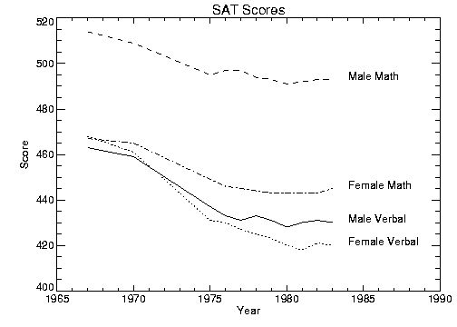
Annotation Example illustrates one method of annotating each graph with its name. The plot is produced in the same manner as was Overplot , with the exception that the x‑axis range is extended to the year 1990 to allow room for the titles. To accomplish this, the keyword parameter XRange = [1967, 1990] is added to the call to PLOT. A string vector, NAMES, containing the names of each score is also defined. As noted in the previous section, the PostScript Helvetica font was selected for this example.
The annotation in Annotation Example is produced using the statements:
; Vector containing the name of each score.
VERBM = [463, 459, 437, 433, 431, 433, 431, 428, 430, 431, 430]
VERBF = [468, 461, 431, 430, 427, 425, 423, 420, 418, 421, 420]
MATHM = [514, 509, 495, 497, 497, 494, 493, 491, 492, 493, 493]
MATHF = [467, 465, 449, 446, 445, 444, 443, 443, 443, 443, 445]
YEAR = [1967, 1970, INDGEN(9) + 1975, 1990]
allpts = [[verbf], [verbm], [mathf], [mathm]]
names = ['Female Verbal', 'Male Verbal', 'Female Math', $
'Male Math']
PLOT, YEAR, VERBF, YRange=[MIN(allpts), MAX(allpts) + 5], $
/YNozero, Title = 'SAT Scores', XTitle = 'Year', $
YTitle = 'Score'
FOR i=1, 3 do OPLOT, year, allpts(*, i), Line = i
FOR i=0,3 do XYOUTS, 1984, allpts(N_ELEMENTS(year) -2, i), $
names(i)
|
|
Using Different Marker Symbols
Each data point may be marked with a symbol and/or connected with lines. The value of the keyword parameter Psym selects the marker symbol. Psym is described in detail in the (Undefined variable: pvwave.waveur).
For example, a value of 1 marks each data point with the plus sign, 2 is an asterisk, etc. Setting Psym to a negative symbol number marks the points with a symbol and connects them with lines. For example, a value of –1 marks points with a plus sign and connects them with lines.
Note also that setting Psym to a value of 10 produces histogram-style plots, as described in a previous section.
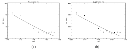
Frequently, when data points are plotted against the results of a fit or model, symbols are used to mark the data points while the model is plotted using a line. Plotting with Symbols illustrates this, fitting the male verbal scores to a quadratic function of the year. The predefined symbols are shown in the first plot and the user-defined symbols are shown in the second plot. The POLY_FIT function is used to calculate the quadratic. The statements used to construct this plot are:
; Use the POLY_FIT function to obtain a quadratic fit.
COEFF = poly_fit(YEAR(0:N_ELEMENTS(YEAR) -2), VERBM, 2, YFIT)
; Create a user-defined plot symbol (A STAR)
XSYM = [0, 0.25, 0, 0.33, 0.5, 0.66, 1, 0.75, 1, 0.5, 0]
YSYM = [0, 0.33, 0.66, 0.75, 1, 0.75, 0.66, 0.33, 0, 0.25, 0]
USERSYM, XSYM, YSYM, /FILL
!P.MULTI = [0,2,1]
; Plot the dataset with the user defined symbol
PLOT, YEAR, VERBM, PSYM = 8, SYMSIZE = 3,/YNozero, $
Title = 'Quadratic Fit', XTitle = 'Year', YTitle = 'Score'
; Plot the quadratic approximation
OPLOT, YEAR, YFIT
; Plot the dataset with the pre-defined symbol
PLOT, YEAR, VERBM, PSYM = 4, SYMSIZE = 3,/YNozero, $
Title = 'Quadratic Fit', XTitle = 'Year', YTitle = 'Score'
; Plot the quadratic approximation
OPLOT, YEAR, YFIT
|
Note |
This example uses data created in Linear Plots. |
|
|
Using Patterns to Highlight Plots
Many scientific graphs use region filling to highlight the difference between two or more curves (i.e., to illustrate boundaries, etc.). Given a list of vertices, the procedure POLYFILL fills the interior of an arbitrary polygon.
Using POLYFILL illustrates a simple example of polygon filling by filling the region under the male math scores with a color index of 75% the maximum, and then filling the region under the male verbal scores with a 50% of maximum index. Because the male math scores are always higher than the verbal, the graph appears as two distinct regions.
|
|

The following discussion describes the program that produced Using POLYFILL. First, a plot axis is drawn with no data, using the Nodata keyword. The minimum and maximum y–values are directly specified with the YRange keyword. Because the y–axis range does not always exactly include the specified interval (see Scaling Plot Axes), the variable MINVAL, is set to the current y‑axis minimum, !Y.Crange(0). Next, the upper math score region is shaded with a polygon containing the vertices of the math scores, preceded and followed by points on the x–axis, (YEAR(0), MINVAL), and (YEAR(n – 1), MINVAL).
The polygon for the verbal scores is drawn using the same method with a different color. Finally, the XYOUTS procedure is used to annotate the two regions.
; Use hardware fonts.
!P.Font = 0
; Set font to Helvetica.
DEVICE, /Helvetica
; Draw axes, no data, set the range.
PLOT, year, mathm, YRange=[MIN(verbm), $
MAX(mathm)], /Nodata, Title='Male SAT Scores'
; Make vector of x–values for the polygon by duplicating the first; and last points.
pxval = [year(0), year, year(N_ELEMENTS(year) - 1)]
; Get y–value along bottom x–axis.
minval = !Y.Crange(0)
; Make a polygon by extending the edges of the math score
; down to the x–axis.POLYFILL, pxval, [minval, mathm, minval], COL=0.75 * !D.N_Colors
; Same with verbal.
POLYFILL, pxval, [minval, verbm, minval], COL=0.50 * !D.N_Colors
; Label the polygons.
XYOUTS, 1968, 430, 'Verbal', Size=2
XYOUTS, 1968, 490, 'Math', Size=2
|
Note |
This example uses data created in Linear Plots. |
Keyword Correspondence with System Variables
Many of the plotting keyword parameters correspond directly to fields in the system variables !P, !X, !Y, !Z, or !PDT. When you specify a keyword parameter name and value in a call, that value affects only the current call — the corresponding system variable field is not changed. Changing the value of a system variable field changes the default for that particular parameter and remains in effect until explicitly changed. The system variables and the corresponding keywords that are used to modify graphics are described in the (Undefined variable: pvwave.waveur).
Example of Changing the Default Color Index
The color index controls the color of text, lines, axes, and data in 2D plots. By default, the color index is set in the !P.Color field of the !P system variable. This default value is normally set to the number of available colors minus 1.


